
Designing with Fable 5.1

I came across Anshu Chimala's How to turn your AI into a world-class designer and with the release of Fable 5.1 I wanted to see if I could try to get AI to pump out better design so I spun up four new variations of the AI Friday website.

All of the prompts used are below.

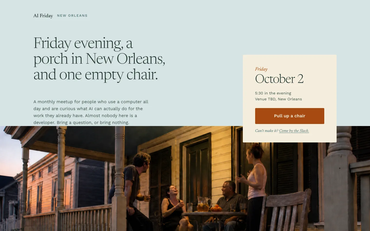
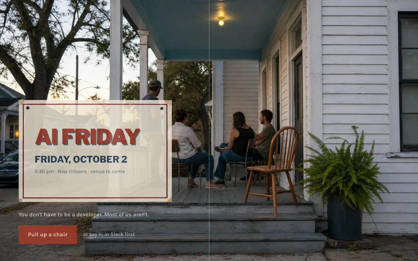
01 Shotgun house 02 Front porch 03 Shop sign 04 Combined

Each frame opens the exhibit below. Every build is a single static page with its imagery generated on the spot.

How we got to four

One claude.ai conversation with Fable 5.1, before any code. The full transcript is in the repo.

  1. Feeling first

    The ask: rethink the AI Friday site from scratch, using the article. Claude's first move was to pin down what a visitor should feel in three seconds. The line that became the brief: this is for you, and it's happening here. The one action: RSVP to the next meetup.

  2. Fifteen sparks

    Deliberately shallow, per the article. Three got picked.

    • Bulletin board
    • Shotgun house
    • Front porch
    • Hand-painted shop sign
    • Lab notebook
    • Recipe card
    • Community radio
    • Almanac
    • Public library
    • Transit map
    • Zine
    • Community garden
    • Sub-tropical light
    • Museum wall labels
    • Playground
  3. Three picks, three layers

    You didn't pick three competing looks, you picked three layers. Shotgun house is a structure, front porch is a scene, and shop sign is a type system. Run each alone, plus a fourth that combines them, and see which one surprises you.

    Claude
  4. Three answers

    Literal shotgun house or just felt? Not sure, so Claude went literal. Porch quiet or lively? Lively. Whole page lettered? No, headlines only.

  5. The pack

    One shared brief, four direction prompts, a critic prompt, a polish checklist, and a launcher. Four Claude Code sessions ran in parallel, each generating its own imagery with the Codex CLI.

The brief

Every session got the same CLAUDE.md before its direction prompt. Placeholder meetup facts, invented member projects, a hard list of what New Orleans is not allowed to look like, and an instruction to stop and say so rather than fake textures in CSS if image generation wasn't available.

CLAUDE.md, the shared design brief

AI Friday — design brief

AI Friday exists to help people in New Orleans build more with AI. We want to create more builders in this city. Today it is two things: a monthly meetup in New Orleans, and a Slack community where people share what they're making. Later it will also publish useful content, so the design should have room for that without featuring it now.

Who this is for

AI-curious knowledge workers: people who use a computer all day, are interested in AI, and are not developers. Many of them quietly assume "this isn't for me." Some already use AI and want tips and tricks. This site is NOT aimed at a technical audience.

The feeling

"This is for you, and it's happening here." Permission, momentum, and place, in that order. Someone should feel invited within three seconds.

Actions

Primary: RSVP to the next meetup. It is a real Friday, a real room, a real date. Secondary: Join the Slack. The site is a door, not a hub. Keep it to one page.

Placeholder facts (the owner will replace these)

Next meetup: Friday, October 2, 2026, 5:30pm. Venue: TBD, New Orleans. Slack: link to "#" for now. Member projects: invent 3–4 plausible ones built by non-developers (a lawyer's intake bot, a teacher's lesson generator, a restaurant's scheduling helper, etc.).

Sections (minimum)

  1. The invitation: next meetup date, place, and a one-line reason to come. This is the hero.
  2. What AI Friday is, in a few sentences.
  3. What people are building: 3–4 short example projects from members.
  4. What you'll walk away with: 3 concrete things a first-timer gets.
  5. Join the Slack.
  6. Footer: location, contact, socials.

Anti-goals

  • Not a developer tool. No dark mode, no monospace, no terminal or code aesthetics.
  • Not a SaaS landing page. No "features" grid, no pricing-page rhythm.
  • Not a tourist brochure. Do NOT use: Mardi Gras beads, fleur-de-lis, jazz iconography, masks, purple/green/gold, Bourbon Street, "Big Easy," "laissez les bons temps rouler," or any French Quarter imagery. New Orleans should be felt the way a local feels it, not sold the way a visitor sees it.

Copy

Write real copy, not lorem ipsum, so the design can be judged. But treat every line as a placeholder: a human will rewrite all of it. Keep it short and plain. No em-dash-heavy AI cadence, no "unlock," "empower," "supercharge," "journey," or "community-driven."

Image generation

Use the Codex CLI for image generation. It is already installed and logged in; make sure it bills the subscription, not an API key. If it isn't available, stop and tell me rather than faking imagery with CSS. Save generated assets in ./assets/.

Tech

A single static page: index.html, styles.css, script.js, assets/. No framework, no build step. We are evaluating the design, not the stack. Must look right on mobile and desktop. Verify your work frame-by-frame in a browser (use a headless browser or Playwright screenshots if no display is available), not just by reading the code.

Working agreement

  • Write a short DESIGN-NOTE.md before coding, describing the creative direction.
  • When the build is done, screenshot desktop and mobile into ./screenshots/, write a one-paragraph NOTES.md on what you tried and what you'd do next, then stop and wait. Do NOT run CRITIC.md until asked.
CRITIC.md, the feedback loop. Not run yet.

I want you to improve this design. To figure out what to focus on, use a Claude Fable 5.1 subagent as a design critic.

Follow this procedure at each iteration: - Capture a screenshot of the current design at desktop width and one at mobile width. - Invoke the critic in a fresh context with just the screenshots and the reference images in ./refs (if any). Do not give it the code, implementation details, the design brief, or earlier critiques. - Ask it to identify the aesthetic this design is going for, imagine how a top design studio would execute that same aesthetic for a neighborhood meetup, and outline the biggest gaps. - If ./refs has images, ask it to rank the reference images and our screenshot together by polish and taste level. Either way, have it give our design a score out of 10 against that studio-level bar.

Give the critic this guidance in its prompt: - Think high-level about structure and composition, then look at the fine details. - Watch for patterns that feel overdone or obviously AI-generated and penalize them: eyebrow labels, generic gradients, excessive cards and containers, too many fonts or text styles, glow effects, decorative elements that serve no purpose, copy that overexplains. - Watch for tourist-brochure New Orleans and penalize it hard. - Watch for anything that would make a non-technical person feel this isn't for them. - Provide tight, specific feedback, not vague prose. - Be bold and opinionated, not safe.

Do at most two iterations, then stop. Save before/after screenshots to ./screenshots/ and both critiques to CRITIQUES.md so I can see whether it's converging. Do not put a target score in the critic prompt; keep its scoring objective. Use the same critic prompt each time.

POLISH.md, the pass a person does last

Polish pass (you, not the agent)

Do this on the one or two directions that survive the critic loop.

Cut. For every element on the page ask what it's earning. AI adds and rarely removes. Expect to delete a third of it. Prompt: "Remove X, Y, and Z. Tighten the remaining spacing. Don't add anything to fill the gap."

Hunt the tells. Walk the list: eyebrow text, generic gradients, cards and containers, font and style sprawl, italic and accent-color overuse. Don't ban them up front; find each one, ask for an alternative, then judge.

Rewrite the copy. Every line, by hand, in your voice. This matters more for AI Friday than for a product site: the voice is the brand and the audience is people you'll be standing in a room with. The agent's copy is scaffolding.

Then, and only then, motion. Once a direction is chosen, the porch scene is a good candidate for a looping generated video clip (fal.ai). Not before.

Save the prompts that didn't work. Re-run them when the next model ships.

The four directions

Each session read the brief, got one direction prompt, generated a random string to settle every decision the prompt left open, wrote a design note before touching code, generated its imagery, built a single static page, checked it frame by frame in a browser, and wrote notes. None has been through the critic loop yet. The copy on every page is scaffolding a person will rewrite.

01

Shotgun house

One long walk through five rooms. The Slack is the kitchen at the back.
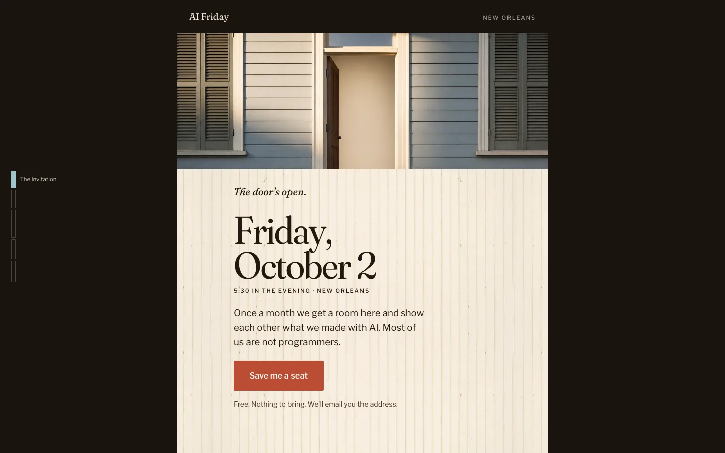
Shotgun house homepage at desktop width
The prompt this session received

Read CLAUDE.md first.

Build the AI Friday homepage as a shotgun house.

The page is one long vertical scroll, and every section is a room, in the order you'd actually walk through one from the street:

  • Front room: the invitation. Next meetup date, place, RSVP. This is the first thing you see through the front door.
  • Second room: what AI Friday is.
  • Third room: what people are building.
  • Fourth room: what you'll walk away with.
  • Kitchen, at the very back: the Slack. That's where the real conversation happens, and it's the last room in the house.
  • Back step: footer.

Doorways are the section transitions. Scrolling should feel like walking through the house, not paging through a website. Go literal: illustrate the architecture, the thresholds, the changing light as you move deeper in. This is the bold version and I want to see it. But the structure must still work if the illustration were removed: the narrow single column, the sequence of rooms, and the sense of arriving at the kitchen should survive on their own.

Seed-string decisions: exact palette, type pairing, how the light changes room to room, wall texture, the rhythm of the doorways. Imagery to generate: doorframes, floorboards, wall texture, the view out the back door. Consider layering images with subtle depth or parallax so the rooms feel physical.

Break the rules of what a homepage looks like, but it still has to work as a homepage.

Follow this procedure: 1. Generate a long, random alphanumeric string using a shell script. Use it as inspiration for every decision the brief doesn't already make. Look beyond the surface for subpatterns, special numbers, anything that inspires you. Don't reveal the string in the design. 2. Write DESIGN-NOTE.md defining the creative direction before writing any code. 3. Generate the imagery with the Codex CLI as described in CLAUDE.md. Do not fake textures, light, or surfaces with CSS gradients, box shadows, or filters. 4. Build it. Verify frame-by-frame in the browser at mobile and desktop widths. 5. Screenshot, write NOTES.md, and stop.

The first three seconds should say: you're invited, this is happening, it's here.

02

Front porch

A warm evening, a few people already there, and one empty chair.

Front porch homepage at desktop width
The prompt this session received

Read CLAUDE.md first.

Build the AI Friday homepage as a front porch on a warm, lively evening.

Not a party. A porch where a few people are already sitting, someone's laughing, there's music coming from somewhere down the block, and there's an empty chair waiting for you. Golden hour tipping into blue hour. The whole page is that scene, and the interface is hospitality: the RSVP is "pull up a chair," the Slack is "come by anytime," the meetup is something you're invited to, not something you register for.

Local detail to build around: haint blue, the pale blue that porch ceilings are painted across the city. Make it the primary color. It's distinctive and quiet and locals will recognize it without a single cliché. Pair it with the warm colors of evening light, wood, and whatever is in people's glasses.

The imagery must be photographic or painterly. No vector illustration, no flat icons. The porch should feel like a real place with real light. Lively means people, movement, warmth. It does not mean a crowd, beads, or a bar.

Generate the hero image first and let it dictate the palette and composition of everything below it. Generate supporting imagery for the other sections only where it adds warmth; empty space is fine on a porch. The page needs a real system beneath the scene: consistent type, spacing, and components that carry the same warmth without the photo doing all the work.

Seed-string decisions: secondary palette, type pairing, exact time of evening, style of the house, what's on the table, how the sections are arranged on or around the porch.

Follow this procedure: 1. Generate a long, random alphanumeric string using a shell script. Use it as inspiration for every decision the brief doesn't already make. Look beyond the surface for subpatterns, special numbers, anything that inspires you. Don't reveal the string in the design. 2. Write DESIGN-NOTE.md defining the creative direction before writing any code. 3. Generate the imagery with the Codex CLI as described in CLAUDE.md. Do not fake textures, light, or surfaces with CSS gradients, box shadows, or filters. 4. Build it. Verify frame-by-frame in the browser at mobile and desktop widths. 5. Screenshot, write NOTES.md, and stop.

The first three seconds should say: you're invited, this is happening, it's here.

03

Shop sign

Hand-painted corner-store signage for the headlines, a quiet sans for the rest.

Shop sign homepage at desktop width
The prompt this session received

Read CLAUDE.md first.

Build the AI Friday homepage using hand-painted shop signage as the type system.

The vernacular is New Orleans corner store, po-boy shop, laundromat, neighborhood grocery: enamel color on wood or brick, lettering done by a sign painter, a drop shadow that was painted not rendered, "COLD DRINKS" and "OPEN" and hand-lettered price boards. It is NOT Western saloon, NOT rustic farmhouse, NOT hipster café. If it starts to feel like a coffee shop chalkboard, it's wrong.

Signage is for headlines only. One big painted sign is the hero: the next meetup, painted like it's hanging over a shop door. Each section header is a smaller painted sign. The month's schedule reads like a menu board. Member projects are the "specials." Everything else, body copy, buttons, form fields, footer, is set in a clean, quiet sans-serif with plenty of air. The signs are the personality; the rest of the page gets out of their way. Lettering the whole page would be exhausting; don't.

This direction lives or dies on texture. Every painted surface must be generated: the sign boards, the painted lettering, the wear at the edges, the wood or brick behind it. A display font with a CSS text-shadow will look like a template and is not acceptable. Generate the signs as images, or generate the surfaces and composite live text over them if the copy needs to stay editable; explain which you chose and why in DESIGN-NOTE.md. Generate the hero sign first and let it set the palette.

Seed-string decisions: the enamel palette, sign shapes, surface material, the sans-serif pairing, layout rhythm.

Follow this procedure: 1. Generate a long, random alphanumeric string using a shell script. Use it as inspiration for every decision the brief doesn't already make. Look beyond the surface for subpatterns, special numbers, anything that inspires you. Don't reveal the string in the design. 2. Write DESIGN-NOTE.md defining the creative direction before writing any code. 3. Generate the imagery with the Codex CLI as described in CLAUDE.md. Do not fake textures, light, or surfaces with CSS gradients, box shadows, or filters. 4. Build it. Verify frame-by-frame in the browser at mobile and desktop widths. 5. Screenshot, write NOTES.md, and stop.

The first three seconds should say: you're invited, this is happening, it's here.

04

Combined

The house is the sequence, the porch is the feeling, the signs are the voice.

Combined homepage at desktop width
The prompt this session received

Read CLAUDE.md first.

Build the AI Friday homepage combining three ideas into one design. This is the ambitious one and it may not work. Try it anyway.

Structure: a shotgun house. One long vertical scroll where each section is a room in the order you'd walk through one: front room (the invitation), middle rooms (what AI Friday is, what people are building, what you'll walk away with), kitchen at the back (the Slack), back step (footer). Doorways are the transitions. Scrolling should feel like walking through the house.

Scene: the front room is a front porch on a warm, lively evening. Golden hour into blue hour, a few people already there, an empty chair, music from down the block. The RSVP is "pull up a chair." Haint blue, the pale blue of the city's porch ceilings, is the primary color. As you move deeper into the house the light changes and the scene gives way to the rooms.

Type: hand-painted shop signage for headlines only. Corner store, po-boy shop, laundromat vernacular; not saloon, not farmhouse, not café. One big painted sign at the front announces the next meetup. Each room's header is a smaller sign. Everything else is a clean, quiet sans-serif.

The risk here is clutter: three ideas fighting for attention. Resolve it by giving each idea one job. The house is the structure and nothing else. The porch is the feeling and lives mostly in the first screen. The signs are the voice and appear only as headers. If any of them tries to do more than its job, cut it back. Explain in DESIGN-NOTE.md how the three hand off to each other, and in NOTES.md what fought with what.

Imagery to generate: the porch scene, the architectural surfaces, the painted signs.

Follow this procedure: 1. Generate a long, random alphanumeric string using a shell script. Use it as inspiration for every decision the brief doesn't already make. Look beyond the surface for subpatterns, special numbers, anything that inspires you. Don't reveal the string in the design. 2. Write DESIGN-NOTE.md defining the creative direction before writing any code. 3. Generate the imagery with the Codex CLI as described in CLAUDE.md. Do not fake textures, light, or surfaces with CSS gradients, box shadows, or filters. 4. Build it. Verify frame-by-frame in the browser at mobile and desktop widths. 5. Screenshot, write NOTES.md, and stop.

The first three seconds should say: you're invited, this is happening, it's here.

What happens next

The critic loop runs in each session: a fresh Fable 5.1 subagent sees only screenshots, names the aesthetic, imagines how a top studio would execute it for a neighborhood meetup, scores it out of ten, and the session revises. Two rounds, then it stops. Andrew's gut reactions go back to the sprint conversation for a sharpening round. Whatever survives gets the polish pass by hand: cut a third of it, hunt the tells, rewrite every line. Nothing here goes live until then.